RULES FOR CREATING A PRESENTATION FOR CHILDREN consultation
RULES FOR CREATING A PRESENTATION FOR CHILDREN
The golden rule for any presentation, proposed by former Apple marketer and current managing director of GarageTechnologyVentures Guy Kawasaki, is 10-20-30: 10 slides in 20 minutes, font size no less than 30. These parameters are ideal for a PowerPoint presentation. A larger number of slides is not memorable, time of more than 20 minutes distracts attention, small font is annoying. Does this rule apply when creating a presentation for children? Applicable especially for children. Holding a child's attention is quite a difficult task, and a boring, long presentation will turn off even an adult. In addition to the “golden” rule, there are a number of other rules that are also suitable for creating a presentation for children. So how do you create a presentation for kids? Preparation, selection of materials for presentation The content of the presentation for children should not be a reprint from the textbook. Ideally, presentation material is selected from several sources. Even when presenting to children, the information must be fresh and relevant. For example, when talking about modern agriculture, there is no need to insert pictures of plowmen with scythes or Soviet Stakhanovites if we are talking about today. Illustrations should correspond to the story, complement it, but not distract attention. It is necessary to take into account the age group of children and their hobbies at the moment. Popular cartoon characters will be viewed more positively than characters from your childhood. As for the text. It is worth re-reading a lot of material on the upcoming topic, making a short summary, but during the presentation, everything that can be said in words must be said in words. Text on slides should be kept to a minimum, especially in presentations for children. Finally, the presentation should have a clear purpose. Of course, in the case of a presentation for children, it is not at all necessary to put it on a slide. This point is important, first of all, for the presenter, so that, being carried away by the related topic, he does not go far to the side. So, the material has been selected, the goal has been determined, the next point is the preparation of the presentation and its design.
Presentation design for children
1. Background. Nowadays you can find many ready-made templates online for any occasion. But we must not forget that a bright, rich background for a presentation will distract from the information being presented. In general, the background is just a background, so as not to distract, but to emphasize the material. So it’s worth choosing a plain background without drawings or any other elements. When it comes to presentations for children, the same mistake often occurs - too much with bright colors and pictures. There is no need to get carried away with bright, contrasting colors that can cause an attack of epilepsy.
2. Illustrations. The teacher must attract children, first of all, with his story, and not with pictures. Of course, this doesn't mean you can't use illustrations. Pictures in the presentation for children are necessary. You need to take into account the age group and their hobbies at the moment. Popular cartoon characters will be viewed more positively than characters from your childhood. Illustrations should be high resolution; there is no need to stretch a small picture across the entire slide - it will cause negative emotions. There is no need to use drawings and photographs simultaneously on one slide, unless this is provided for by the GCD. The presentation should be made in the same style; photographs and drawings should be of the same size.
And finally, don’t forget that all images on the Internet have an owner. At the end of the presentation it is worth providing a list of illustrations and links to sources; this is not only a tribute to copyright, but also a useful practice for children.
3. Font. It is necessary to avoid using different fonts - this distracts attention and tires. The font size should be large enough to be read from the back of the desk. The test must be readable. Avoid using fonts that are illegible, too narrow, or serif fonts. And finally, a simple rule - light text is placed on a dark background and vice versa.
- Animation. It’s very simple here, if animation can be avoided, this should be done. Of course, in a presentation for children you want to use as many effects as possible. Also, animation takes time. It will take a few extra seconds to wait for the text to appear, letter by letter. Actually, the presentation The goal of the presenter is not just to present material, but to generate interest. This is perhaps the most important point in a presentation for children. A boring lecture, even illustrated with beautiful pictures and animations, remains a boring lecture. The presentation of material should be in the form of a story, a story. It is ideal if children are participants in this story. A presentation for children should be interactive, and children should actively participate. It makes sense to diversify the presentation with riddles and questions. Even 20 minutes of an interesting story can get boring. Watching a presentation is a strain on the eyes. It is better to give the presentation in parts, alternating with practical tasks, games or light physical activity. After finishing the presentation, it is necessary to summarize and draw a conclusion. As you know, the last phrase is always remembered better. So let the last phrase be good advice or parting words.
- Methodological recommendations for the creation and use of multimedia presentations in activities with preschool children.
Contents of information
1. Use short words and sentences.
2. Minimize the number of prepositions, adverbs, and adjectives.
3. Headlines should grab the audience's attention.
4. Preferably horizontal arrangement of information.
5. The most important information should be located in the center of the screen.
6. If there is a graphic image on the slide, the caption should be located below it.
7. The form of information presentation must correspond to the level of knowledge of the audience of listeners for whom the presentation is being shown.
8. In presentations, a period is put in the headings.
9. It is not permissible to fill one slide with too much information: it is difficult for a person to remember more than three facts, conclusions or definitions at a time.
10. There is an opinion that a slide should contain no more than 290 characters (including spaces).
11. The greatest effectiveness in conveying content is achieved when key points are displayed one on each slide.
Presentation structure:
1. The font size for headings is at least 24, for information - at least 22. The font size should be as large as possible on the slide!
2. It is not recommended to mix different types of fonts in one presentation. To highlight information, different styles are used: bold, italic.
3. It is better to use fonts Arial, Verdana, Tahoma, Comic Sans M
4. Cool colors are preferred for the background
5. It is recommended to use no more than three colors on one slide: one for the background, one for the title, one for the text. Use contrasting colors for the background and text. Pay attention to the color of hyperlinks (before and after use)
6. Animation effects.
7. Do not overuse various animation effects; they should not distract attention from the content of the information on the slide.
8. It is not recommended to use letter-by-letter animation and rotation, as well as the use of more than 3 animation effects on one slide. Animation shouldn't be intrusive!
9. It is not recommended to apply animation effects to titles, especially such as “Rotation”, “Spiral”, etc.
10. Break large lists and tables into 2 slides. It is better to use lists of 3-7 points.
11. The text must be clearly visible on any screen!
12. The presentation appears differently on a monitor screen and through a projector (colors through the projector will be distorted and will appear darker and have less contrast).
13. Place only optimized (reduced) images in the presentation.
14. You can check the “formal” criteria for a presentation using the Textosaurus program.
Main mistakes in presentation design:
1. There is no title page.
2. The author and contact information are not indicated.
3. No content.
4. No conclusions.
5. Linear presentation type, navigation not configured.
6. Reading text from a presentation, i.e. printed and spoken text should not duplicate each other!
7. Colorful backgrounds on which the text is not visible.
8. Lots of small text.
9. Fuzzy, stretched pictures and illustrations.
10. Many unjustified various technical effects (animation, sound and video files) that distract attention from the content.
11. Unreadable WordArt objects, especially those with shadows and waves.
12. Correct writing and formatting of texts - spelling, punctuation and style, rules for formatting texts, bibliography, etc.
13. The style and design of the presentation should be consistent
14. Do not use underlining, because it looks like links.
Presentation “Pets” for middle school children
"Pets"
Educator:
Ivanova E.S.
Purpose:
to give an idea about domestic animals.
Tasks:
- show the distinctive features of domestic animals;
- clarify the names of the adult animal and the baby;
- to cultivate love and respect for nature and “our smaller brothers.”
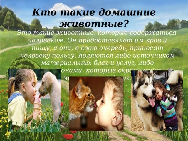
What are pets?
These are animals that are kept by humans. He provides them with shelter and food, and they, in turn, bring benefits to people, are either a source of material goods and services, or companions who brighten up human leisure time.
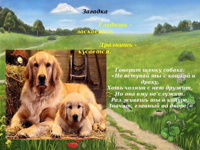
Riddle
You stroke - it caresses, You tease - it bites.
The dog says to the puppy:
“Don’t get into a fight with a cat,
Although the owner is friends with her, But she does not serve him. Since you live in a kennel, that means you’re in charge in the yard!”
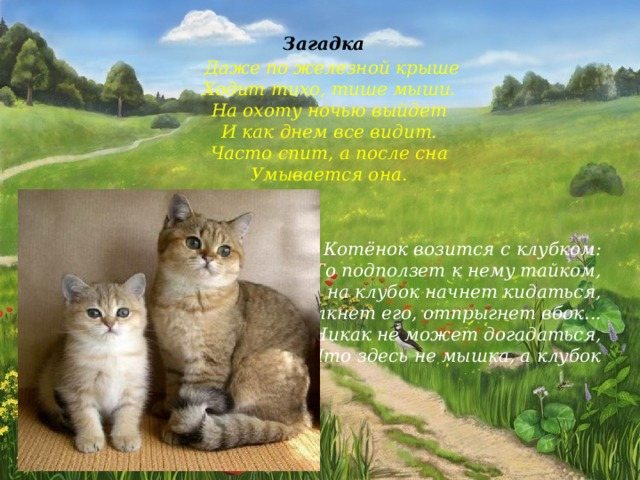
Riddle
Even on an iron roof He walks quietly, quieter than a mouse. He goes hunting at night and sees everything as during the day. often sleeps, and after sleep she washes herself.
The kitten is fiddling with a ball:
It will crawl up to it secretly, Then it will start throwing itself at the ball, It will push it, it will jump to the side... It can’t guess that there is not a mouse here, but a ball
Riddle:
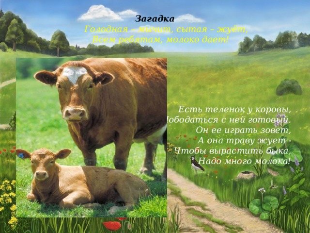
Hungry - moos, well-fed - chews, Gives milk to all the children!
The cow has a calf,
ready to fight with her. He calls her to play, And she chews grass - To raise a bull, You need a lot of milk!
Riddle
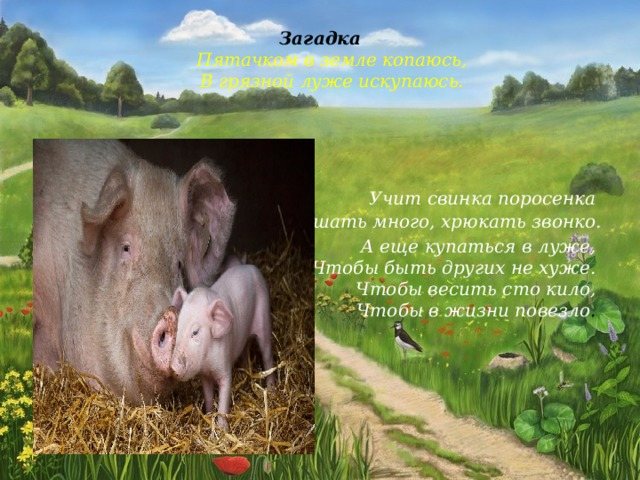
Piglet digs in the ground, I take a swim in a dirty puddle.
The pig teaches the piglet
to eat a lot and grunt loudly.
And also swim in a puddle,
To be no worse than others. To weigh a hundred kilos, To be lucky in life .
Riddle
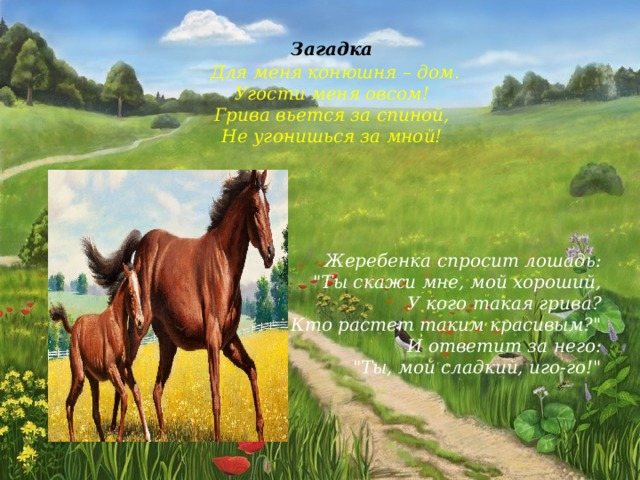
For me, the stable is home. Treat me to some oats! The mane curls behind my back, You can’t keep up with me!
The horse will ask the foal:
“Tell me, my dear, Who has such a mane? Who grows up so beautiful? And he will answer for him: “You, my sweet, yoke!”
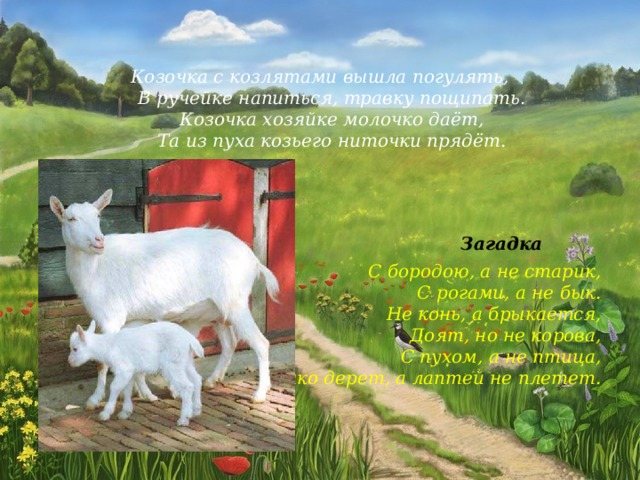
The goat and her kids went out for a walk,
got a drink in the stream, and nibbled some grass. The goat gives milk to the mistress, and she spins threads from the goat's fluff.
Mystery
With a beard, not an old man,
With horns, not a bull. It’s not a horse, but it kicks, It milks, but it’s not a cow, It has fluff, but it’s not a bird, It pulls its bast, but it doesn’t weave bast shoes.
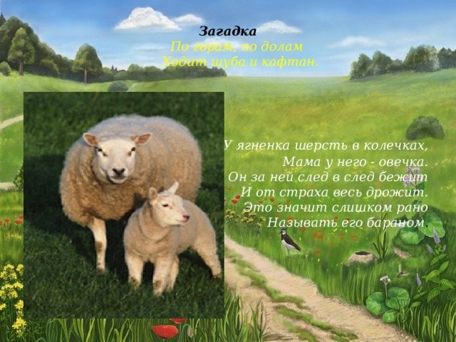
Riddle
A fur coat and a caftan walk across the mountains and valleys .
The lamb has wool in rings,
His mother is a sheep. He runs after her and trembles all over with fear. This means it's too early to call him a ram .
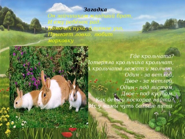
Mystery
He is the little brother of the bunnies,
and the child is happy with him. A ball of fluff, a long ear, Jumps deftly, loves carrots
Where are the rabbits?
The mother rabbit lost her babies, and the babies lie and are silent. One - behind the willow tree, Two - behind the broom, One - under the leaf, Two - under the bush. How to find children as quickly as possible? Mom has a little more than five of them .
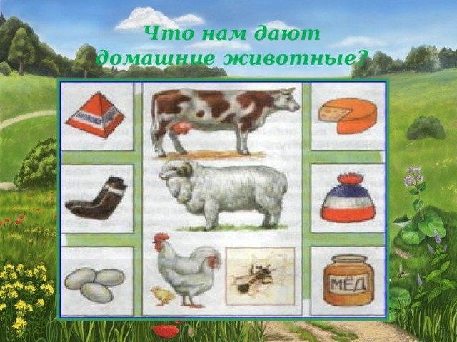
pets give us
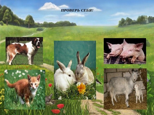
CHECK YOURSELF!
What animals are called domestic?

THANK YOU
FOR YOUR ATTENTION!!!


